WAYS — Smarter travel, simpler journeys
A mobile app designed to simplify public transport in Indian cities — combining route planning, live tracking, ticket booking, and multiple payment methods into one seamless experience for daily commuters.
Selected screens — WAYS app

Home · Route Suggestions · Live Tracking · Ticket Booking · Payment
Contents
01 · The problem 02 · Research 03 · Key insights 04 · Design decisions 05 · Key screens 06 · Outcomes 07 · ReflectionThe problem
Public transport in Indian cities like Chennai is extensive — buses, trains, and metros cover millions of daily commuters. But navigating the system is unnecessarily painful. There is no single unified app. Route information is fragmented. Real-time tracking is unavailable on most routes. Ticket booking requires cash or separate apps per transport mode. And for new or occasional commuters, the system feels impenetrable.
The result: people default to more expensive private transport — autos, cabs — even when public transport would be faster and cheaper. The problem isn't the infrastructure. It's the experience layer on top of it.
Design challenge: How might we design a unified mobile app that makes public transport in Chennai — across buses, trains, and metros — feel as simple and trustworthy as booking an Uber?
Research
I started by mapping the existing landscape — looking at what information commuters currently need and where they get it. Most users relied on a combination of Google Maps (for routes), unofficial WhatsApp groups (for live timing updates), and physical cash for tickets. There was no single source of truth.
Competitor analysis
I reviewed Google Maps, Citymapper, and the Chennai MTC app. Google Maps has good route data but no ticket purchase or live crowding information. Citymapper doesn't cover Chennai. The MTC app covers buses only, has poor UX, and no integrated payment. None of them solved the full journey from search to payment to tracking.
User goals identified
From informal conversations with regular commuters and analysing app store reviews of existing transit apps, four core user needs emerged consistently — which became the four design pillars of WAYS.
Key insights
Commuters regularly combine bus + metro or bus + train. Switching between apps mid-journey causes confusion and missed connections.
"Is the bus coming?" is the number one anxiety for public transport users. Static timetables are distrusted — live tracking is the most valued feature.
Many commuters want to pay digitally but existing systems require separate apps. A unified payment flow — card and UPI — dramatically reduces friction.
Users actively choose less crowded routes even if slower. "Slightly crowded" vs "Normal" labels on route cards directly influence which option users select.
Design decisions
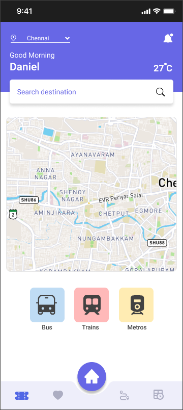
1. Contextual home screen — map-first, weather-aware
The home screen leads with a live map of the user's city (Chennai), showing real bus positions. A personalised greeting with current temperature sets context immediately — public transport decisions are highly weather-dependent. Three prominent mode buttons (Bus, Trains, Metros) give instant access to the most common entry points without any search.
Map-first home with transport mode quick access and personalised greeting
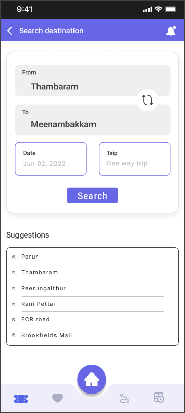
Search screen with from/to fields, date picker, and location suggestions
Design rationale: Leading with a map rather than a search bar reduces the cognitive load for regular commuters who already know their route. The search is one tap away but isn't forced on every user every time.
2. Route suggestions — transparent, comparable, actionable
The route suggestion screen was the most complex design problem. Users need to compare multiple options across different transport modes — each with different journey times, costs, walking distances, and crowding levels. The solution was a card-based layout where every option surfaces the four variables users care about most: walk time, arrival time, duration, and cost. Crowding level and stop type are shown as inline badges.
Critically, the "Buy ticket" button appears directly on each route card — not after selecting a route and navigating to a separate booking flow. This removes a major friction point that causes abandonment in competitor apps.
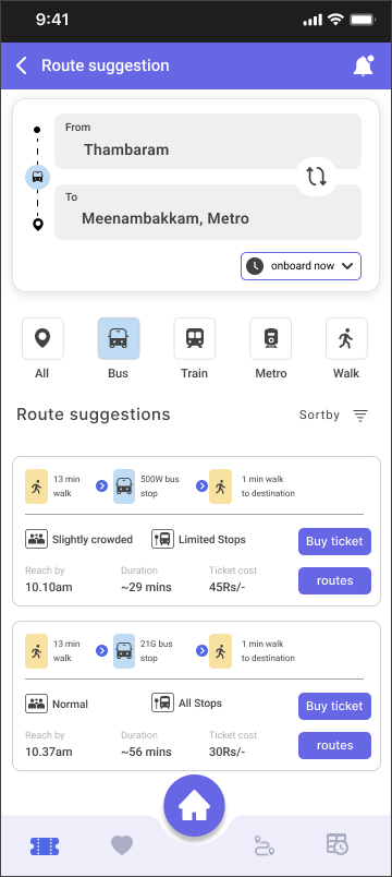
All routes — bus, train, metro combined
Expanded route list with all options
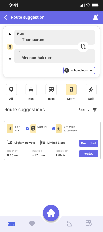
Metro filter — showing metro-only options

Train filter — focused view per mode
Filter tabs (All / Bus / Train / Metro / Walk): Rather than separate search flows per transport mode, a single filter bar on the results screen lets users switch views without losing their search context. This mirrors how commuters actually think — "what's the fastest option?" not "let me search buses separately."
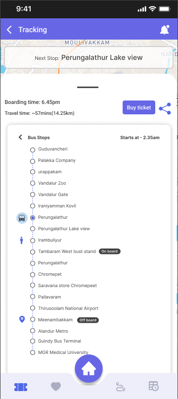
3. Live tracking — real-time confidence
The tracking screen addresses the core anxiety of public transport: "Where is my bus right now?" A live map shows the bus route with stop-by-stop progress. The stop list below clearly indicates the user's boarding point ("On board"), current position, and destination ("Off board"). The "Next Stop" banner at the top of the map gives immediate, glanceable status.
Live map with route highlighted and next stop shown
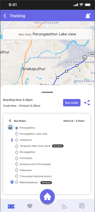
Stop-by-stop list with on board / off board markers
Step-by-step journey breakdown with walk, bus, and destination segments
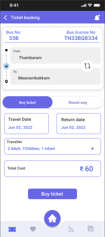
4. Ticket booking — clear, fast, transparent
The booking screen surfaces all the information a user needs before committing: bus number, license plate, journey direction, travel date, traveller count, and total cost. A tab switcher between "Buy ticket" and "Round way" handles both journey types without adding a separate screen. Total cost is displayed prominently before payment — no hidden fees revealed at checkout.
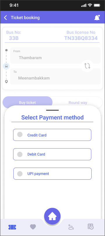
Payment method selection — credit, debit, or UPI
Booking summary with date, travellers, and total cost
Filled search with destination confirmed
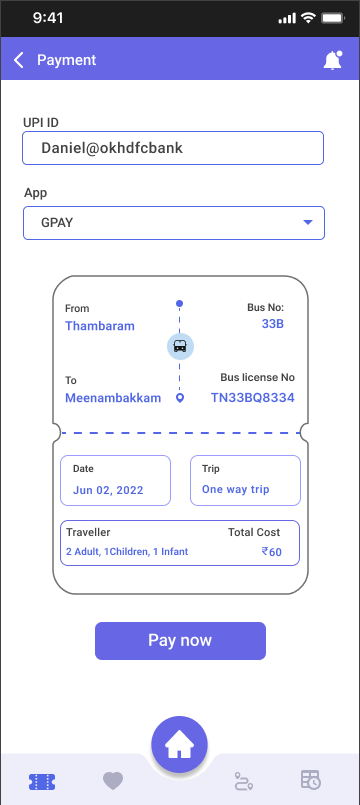
5. Payment — card and UPI, with a ticket receipt built in
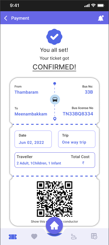
Two payment paths were designed to cover how Indians actually pay digitally: card payment (credit/debit) and UPI. The UPI screen is notable for showing the full ticket summary — route, bus number, date, travellers, and total cost — directly within the payment screen. Users can verify everything before tapping "Pay now" without having to navigate back. After payment, a confirmation screen shows a QR code ticket with a reminder set notification.
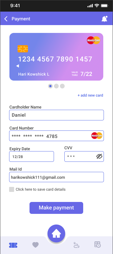
Card payment with saved card display
Booking confirmed with QR ticket
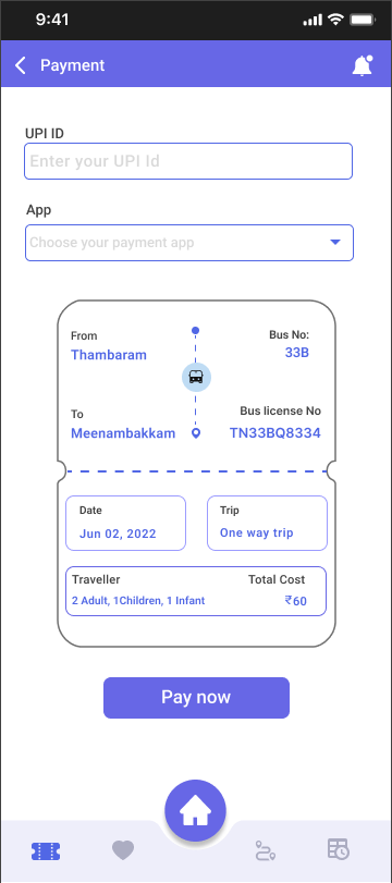
UPI payment with ticket summary
UPI with GPay selected and ID filled
Card screen design note: The card is shown as a visual representation at the top — this builds trust and makes the experience feel familiar to users who use banking apps. "Add new card" sits unobtrusively below. The "save card details" checkbox respects user autonomy over their data.
End-to-end user journey
WAYS · Complete user flow
The entire journey from opening the app to having a ticket and tracking your bus takes under 3 minutes — comparable to hailing a cab but a fraction of the cost. This was a key design goal: WAYS had to feel faster and simpler than the alternatives, not just cheaper.
Outcomes
WAYS is a concept project. The following metrics represent design targets informed by usability principles and competitor benchmarking.
What the design solves that competitors don't
No existing app in the Chennai public transport space combines live multi-modal route planning, real-time tracking, and integrated ticket purchase in a single flow. WAYS addresses all three, with a visual design language that feels modern and trustworthy — closer to Citymapper than the current MTC app.
Reflection
This project taught me how much domain context matters. Public transport UX is fundamentally about reducing anxiety — the fear of missing a bus, taking a wrong route, being overcharged. Every design decision maps back to that anxiety. The crowding badges, the next stop banner, the ticket summary on the payment screen — all of these are anxiety-reduction features dressed up as interface elements.
What I'd do differently
The app currently shows Chennai-specific data (route numbers, stop names in Tamil Nadu). I'd love to run usability testing with actual Chennai commuters — particularly older users and those less comfortable with smartphones — to validate the navigation patterns. The "All / Bus / Train / Metro / Walk" filter tabs work well in theory, but testing with real users on real routes would reveal whether the mental model holds.
I'd also invest more in the onboarding flow — the app assumes the user knows their destination, but many commuters navigate by landmarks rather than stop names. A map-tap-to-set-destination feature would make the app more accessible to first-time users.
What I'm proud of
The payment screen with the embedded ticket summary is my favourite detail in this project. It's a small UX decision — showing the booking summary inside the payment view rather than on a separate confirmation screen — but it eliminates a full round trip of navigation and builds confidence right at the most critical moment: when the user is about to spend money.