LoanEase —
smarter loans,
seamless experience.
A mortgage and personal loan comparison platform that empowers everyday people aged 22–55 to find, compare, apply and manage loans entirely on their own — without needing a solicitor or broker.
Designed for the person who thinks they need a solicitor — but doesn't.
Applying for a mortgage or personal loan in the UK typically requires navigating jargon-heavy comparison sites, paying £1,000–£3,000 in broker and solicitor fees, and enduring weeks of silence with no idea where your application stands. LoanEase was designed to change that entirely.
The platform lets anyone — from a 22-year-old first-time buyer to a 55-year-old remortgager — compare real loan offers from multiple banks, apply with a guided step-by-step form, upload documents once, track their application in real time, and manage repayments after approval. All in one app. No professional needed.
The mortgage process was designed for professionals, not people.
Getting a loan in the UK is needlessly complex. Jargon terms like LTV, AIP, ERC and conveyancing stop most people before they start. Those who push through are forced to provide the same documents multiple times to different parties, wait weeks with zero status updates, and ultimately pay a professional to navigate a system that should be accessible to everyone.
Millions of people pay £1,000–£3,000 in broker fees not because the process is complex — but because no platform has made it simple enough to do alone.
Jargon causes abandonment
6 out of 6 interview participants cited specific financial terms — LTV, AIP, ERC — as the primary reason they gave up or sought professional help.
Documents submitted 3+ times
Every participant described uploading identical documents to their broker, then the bank, then the solicitor. Universally the most frustrating part of the process.
Zero visibility on progress
5 of 6 participants had no idea where their application stood without actively chasing. Weeks of silence followed by urgent requests was the universal experience.
Fear drives solicitor dependency
People don't use solicitors because the process is legally complex. They use them because they're afraid of making an irreversible mistake they don't understand.
Six interviews. Three archetypes. One clear direction.
Before designing a single screen, I conducted 6 qualitative interviews with people aged 24–51 who had experience with loans, mortgages or the need for either. The interviews covered their current process, biggest pain points, what would make them trust an app with something this important, and what would make them stop and call a professional.
Three distinct user archetypes emerged — each with different needs, anxieties and digital comfort levels.
Priya, 24 — The First Timer
Graduate, first job, wants her first flat. Closes the browser every time she hits jargon. Needs plain English, eligibility check before applying, and a progress bar so she doesn't quit.
Marcus, 37 — The Remortgager
Teacher, time-poor, fixed rate ending. Has used a broker before and felt like he signed things he didn't understand. Wants efficiency, total cost comparison, and to upload documents once.
Diane, 51 — The Late Adopter
NHS manager, buying alone post-divorce. Capable but cautious. Needs FCA regulation displayed prominently, a real phone number, and the assurance that a human is available if needed.
Competitor Analysis
Reviewed Habito, Trussle, MoneySuperMarket and HSBC's own mortgage tool. Common gaps: no jargon explanations, no unified document upload, no real-time tracker, no post-approval management.
Structure before style.
Before applying any colour, typography or branding, I built grey-box wireframes for every screen. This stage was about making structural and hierarchy decisions — where does the eligibility figure live, how many steps should the application form be, what information does a tracker screen need to show.
The wireframes confirmed that the key UX patterns from research — jargon tooltips, single document upload, real-time status tracker — could be designed without creating complexity or cognitive overload.


The wireframe stage revealed one critical structural insight: the home screen needed to surface the user's estimated eligibility amount immediately — before any action — because research showed this was the single most anxiety-reducing piece of information. Users don't need to search for it; it should be the first thing they see.
Trust built before the first form field.
The onboarding flow serves a single purpose: by the time a user reaches the login screen, they should already trust LoanEase with something as important as their mortgage. Three onboarding slides address the three core product promises — best loan offer instantly, smart EMI calculator, and bank-grade security.


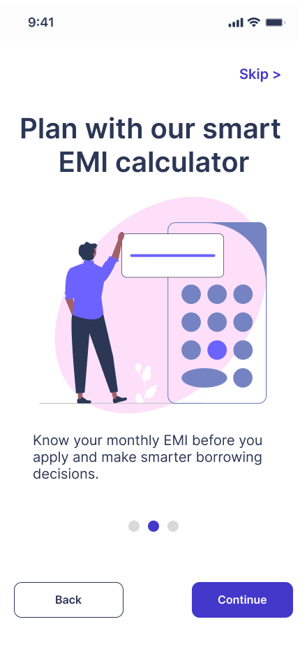


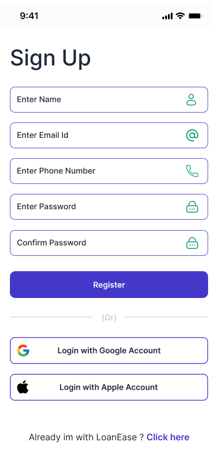
The pink-to-purple gradient system was chosen deliberately — soft and approachable for users who feel intimidated by financial platforms, while still feeling premium and trustworthy. The illustrations on each onboarding slide are purposefully non-threatening, showing people succeeding rather than banks and numbers. Social login via Google and Apple reduces friction and drop-off at the critical first-use moment.
↑ Research insight: trust must be established before users will share financial informationYour financial situation, at a glance.
The home screen exists in two states — one for new users with no active loan, and one for existing users managing a live loan. This conditional design avoids a blank or confusing experience for first-time users while giving returning users immediate access to the most critical information: their next payment date and amount.


Two states — one screen
New user home leads with a prominent search prompt — "Find your new loan" — and four quick link cards: EMI Calculator, Application Tracker, Compare Loans, Get Help. These directly address the four most common first actions identified in research.
The active loan home replaces the search prompt with the loan card showing the next payment date and amount (£1,200 due 23rd Oct) with a "show more details" option. The user's most urgent financial information is surfaced immediately, not buried inside a sub-menu.
↑ Research: users' biggest anxiety is not knowing what's due and whenMultiple banks. Real numbers. One screen.
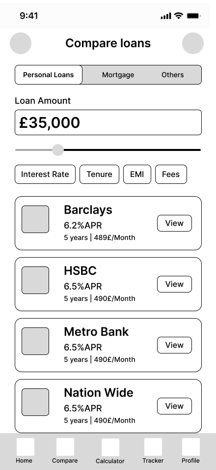
The compare screen is the commercial heart of LoanEase and the direct solution to the problem identified in research — users spending hours across multiple bank websites trying to compare loan terms. LoanEase brings all of that into a single, filterable view with consistent formatting.


From list to detail in one tap
The compare screen opens with a loan amount input and slider — users set their amount first, then see matched lenders below. Filter chips (Interest Rate, Tenure, EMI, Fees) let users sort by what matters most to them. Each lender card shows APR, monthly payment and loan amount in a consistent format so comparison is instant.
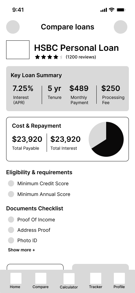
The loan detail screen goes deeper — a Key Loan Summary panel shows interest rate, tenure, monthly payment and processing fee in a clear 4-column grid. The Cost & Repayment section shows total payable and total interest with a pie chart. Eligibility requirements and a documents checklist are shown before the apply CTA, so users know exactly what they're getting into before committing.
↑ Research: users wanted total cost shown, not just monthly payment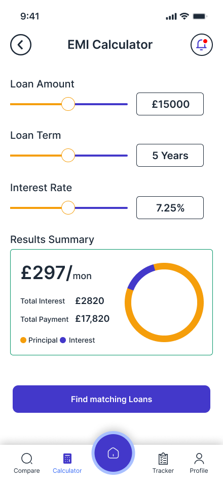

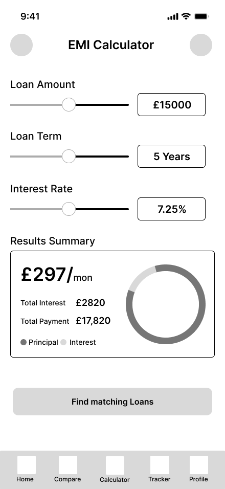
The EMI Calculator uses three sliders — Loan Amount, Loan Term, Interest Rate — that update the results summary in real time. Monthly payment, total interest and total payment are shown with a donut chart breaking down principal versus interest. A "Find matching loans" CTA at the bottom creates a natural handoff from calculation to comparison — the user knows their number, now find the lender that matches.
Three steps. No surprises. Full transparency.
The application flow was designed around a core research finding: users abandon forms when they feel they might be making a mistake they can't undo. Every design decision in this flow is about reducing that fear — showing progress, explaining what's needed and why, and letting users review everything before submitting.
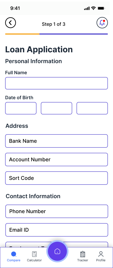 Step 1 — Personal Info
 Step 2 — Documents
 Step 3 — Review
 Submitted
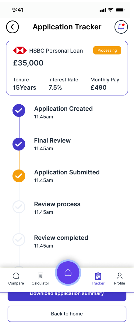 Track Status
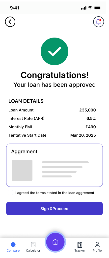 Approved
Step 1 — Personal info. Step 2 — Documents.
Step 1 collects personal and banking details with clearly labelled fields — Full Name, Date of Birth, Address, Bank Name, Account Number, Sort Code, Phone Number, Employment Type. A consent checkbox for credit check and privacy policy appears at the bottom, keeping legal requirements transparent without burying them.
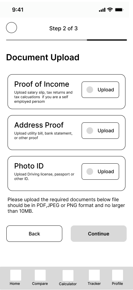
Step 2 — Document Upload — was directly shaped by research. All three required documents (Proof of Income, Address Proof, Photo ID) are shown upfront with clear descriptions of what's acceptable. The instruction note specifying file format and size limit (PDF, JPEG, PNG · max 10MB) is shown before the continue button, not discovered mid-upload.
↑ Research: showing all required documents upfront prevents mid-process abandonment
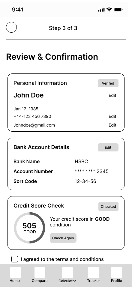
Step 3 — Review. Then confirm.
The review screen is the most important in the entire application flow. It shows a complete summary of what will be submitted — Personal Information (with Edit links), Bank Account Details (with masked account number), and a Credit Score Check showing the live score in a circular gauge with a "Good" indicator.
Showing the credit score at this stage — before submitting — was a deliberate decision. Research participants consistently said fear of an unexplained rejection was a primary anxiety. Seeing a "Good" credit score before submitting gives users the confidence to proceed.
The submission confirmation screen delivers a reference number and estimated review time (2–3 working days), then offers three clear next actions: Track Application, Back to Home, Download Application.
↑ Research: credit score visibility before submission reduces fear of unexplained rejectionNo more chasing. No more silence.
The application tracker directly solves the most universally hated part of the loan process — having no idea where your application stands. Five of six interview participants described weeks of silence followed by urgent requests. The tracker gives users complete visibility without requiring them to contact anyone.

Six-stage vertical timeline
The tracker shows the application moving through six clearly named stages: Application Created, Final Review, Application Submitted, Review Process, Review Completed, Loan Started. Each completed stage shows a checkmark and timestamp. The current stage is visually distinct.
The tracker list view (Existing Application / Saved Application tabs) lets users manage multiple applications simultaneously — particularly useful for users comparing mortgage options across lenders. Saved applications can be deleted or viewed in detail. The active application shows a "Processing" status badge.
↑ Research: 5/6 users had to chase status weekly — tracker eliminates this entirelyApproved. Signed. Managing — all in the app.
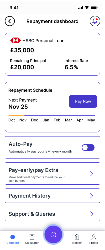
LoanEase doesn't stop at approval. The complete post-approval journey — signing the agreement, receiving funds, managing repayments, viewing payment history and making early closure — is designed within the same app. This is a feature no competitor offers end-to-end, and it directly removes the need for ongoing professional involvement.


Repayment dashboard + payment history
The repayment dashboard shows the loan balance, remaining principal, interest rate, and a monthly repayment timeline — with the next payment date and amount prominently displayed. Auto-Pay can be toggled on to remove the monthly friction of manual payment. A "Pay-early/pay Extra" option lets users reduce their loan burden with additional payments.
Payment history shows a complete log of all payments with Receipt buttons for each — crucial for users who need documentation for tax purposes or personal records. The early closure screen shows the outstanding balance, interest savings and payment charges before asking users to confirm — protecting them from making an uninformed decision.
↑ Post-approval management is entirely missing from every competitor app reviewedSecurity, documents and preferences — all in one place.
The profile section was designed around a key research finding: users want to know their data is protected. The profile surface gives users full control — two-factor authentication, biometric app lock, linked bank accounts, notification preferences, and a complete document vault containing all loan agreements and personal documents.
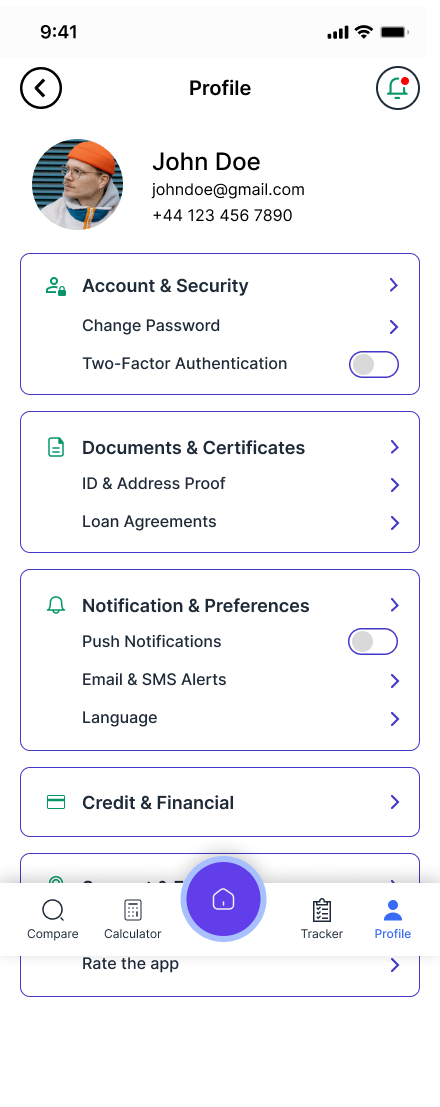


The documents and certificates section was a direct response to research — participants consistently said they lost track of loan agreements and needed to re-request documents from their bank. LoanEase stores all Active Loan Documents, Closed Loan Documents and Personal Documents in one accessible vault, downloadable at any time.
Every decision traced back to research.
The visual language, structural choices and feature set of LoanEase were not aesthetic preferences — they were direct responses to what six real users told me during research.
Pink/purple palette — not navy blue
Financial apps default to navy and grey, which research participants associated with intimidation and formality. The warm pink-to-purple system feels approachable and modern — reducing the anxiety that makes users reach for a solicitor.
Research finding: tone and visual warmth directly affects willingness to engageCredit score shown before submitting
Showing the credit score in the review step — before the user commits — was a direct response to the most common fear in research: being rejected without understanding why. Seeing "505 — GOOD" before submitting gives users the confidence to proceed.
Research finding: fear of unexplained rejection drives abandonmentDocuments uploaded once, used everywhere
All 6 research participants described uploading the same documents to their broker, bank and solicitor separately. The document upload screen specifies all three required documents upfront, then uses them across the application automatically.
Research finding: 6/6 submitted same documents 3+ timesTracker visible from tab bar
The application tracker is a permanent tab in the bottom navigation — not buried in a menu. This was a direct response to 5/6 participants saying they had to chase status weekly. Making the tracker immediately accessible removes that friction entirely.
Research finding: status visibility was the most requested featureTotal cost shown prominently
Every loan detail screen shows Total Payable and Total Interest as primary information — not buried below the fold. Research showed users made poor decisions when only seeing monthly payments, not understanding the full cost of borrowing over time.
Research finding: Marcus chose wrong term because he only saw monthly EMIPost-approval journey fully designed
No competitor app reviewed offered end-to-end management from application to loan closure. LoanEase includes repayment dashboard, auto-pay, early closure calculator, payment history with receipts — removing the need for any ongoing professional involvement.
Research finding: users felt abandoned after approval with no management toolsFrom first open to final repayment.
LoanEase is the only platform designed to cover the complete lifecycle of a loan — onboarding, comparison, application, approval, repayment and closure — in a single coherent experience.
Discover & Trust
Onboarding slides establish the three core promises — best offer, smart calculator, bank-grade security. Login and sign-up with Google/Apple support reduce friction to zero.
Calculate & Compare
EMI Calculator helps users understand what they can afford before comparing. Compare screen shows real offers from multiple banks with consistent formatting — APR, monthly payment, fees — all filterable.
Apply in 3 Steps
Guided 3-step application: personal details → document upload → review with credit score. Progress bar shows where the user is at all times. Everything is reviewable and editable before submitting.
Track in Real Time
6-stage tracker shows exactly where the application is — Application Created, Final Review, Submitted, Review Process, Review Completed, Loan Started — with timestamps at each completed stage.
Approve & Sign
Approval screen shows complete loan details and agreement. User reviews, checks the agreement checkbox and signs digitally. Funds release confirmation follows with full summary.
Manage & Repay
Repayment dashboard, auto-pay, payment history with receipts, early closure calculator. Everything needed to manage an active loan without contacting the bank or a professional.
Closure & Celebration
Loan fully repaid screen with confetti illustration, total paid summary and reference number. Download Early Closure Letter directly from the app. Clean, satisfying end to the journey.
What this project taught me about designing for real people.
LoanEase is the most research-grounded and technically comprehensive project in my portfolio. Here is an honest assessment of what worked, what I'd do differently, and what I learnt.
-
Research changed everything. Before I spoke to users I assumed the main design problem was visual — making a financial app look approachable. After 6 interviews I understood the real problem was structural: jargon, document repetition, and status invisibility. Every major design decision came from those conversations, not from aesthetic preference.
-
Designing 30+ screens taught me system thinking. When you design one screen in isolation it's easy. When you design 30 screens that all need to feel coherent, you have to think in systems — consistent spacing, reusable components, typographic hierarchy that works at every density. This project pushed my Figma skills significantly.
-
The post-approval journey was the most valuable design decision. No competitor covers this. By designing the full repayment management experience — dashboard, payment history, early closure, loan fully repaid — LoanEase becomes genuinely irreplaceable rather than just another comparison tool. This came directly from research participants saying they felt abandoned after approval.
-
I'd add usability testing on Maze.co next. The wireframe and hi-fi stages were completed without formal testing. The next step for LoanEase would be Maze.co task-based testing — specifically testing the 3-step application flow for drop-off points, and the compare screen for comprehension of the loan detail information.
-
The colour choice was a deliberate UX decision, not just aesthetics. Pink and purple in a financial app is unconventional. It was chosen because research showed users felt intimidated by the visual language of traditional banking. The warmth of the palette reduces anxiety — and anxiety reduction is the core UX challenge of the entire platform.
-
If I built a v2, I'd add a jargon glossary. Several research participants cited specific terms they didn't understand — LTV, AIP, ERC, conveyancing. A persistent glossary accessible from any screen, plus inline term explanations in the loan detail view, would directly address this and reduce the solicitor dependency even further.